DropDrop Logo Redesign
Earlier this year I met up with Adam and James Mikrut at Keen Studio who’s helping me re-brand DropDrop. We started with a logo redesign phase that would help inform everything else. Our discussion, along with the innumerable days I have already spent trying to give identity to a brand, revealed an irrefutable truth:
Logo design is extremely difficult
Connecting name, brand, product and sprinkles of symbolism all in one pint-sized object is not a modest task. Pondering typography, color, and all the other indirect mechanisms to a brand is a massive undertaking.
 Fine-tuned color palette
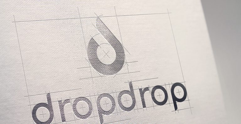
Keen Studios says, “We started with the direction of a geometric logo form, incorporating two d’s with a drip or two drips. We began sketching initial forms and shapes that worked with the direction. We then began digitally recreating some of the concepts. One form stood out above the rest, we singled that out and continued to fine tune it to the best it could become. From that point we started pairing the mark with typefaces we customized to relate to the mark. GT Walsheim has the characteristics that we were looking for to complement it.
From there we started to explore the use of color and how it effected the logo. We chose the PMS 2985 a sky blue because of its bright, modern appearance and we felt that PMS 072 cobalt was a natural complement to the sky blue.
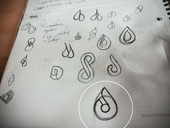 Early logo exploration
The one thing that makes logo design so tough is that there is no rulebook. You can’t just sit down and follow a procedure. The process is exploratory, only entertaining recommendations. So, how do we know if this new logo is good or not? Humbly put, we don’t. Like music, It’s all subjective preference and virtually everything is up for discussion. Hopefully, which was the ultimate goal, this new DropDrop logo stands the test of time.